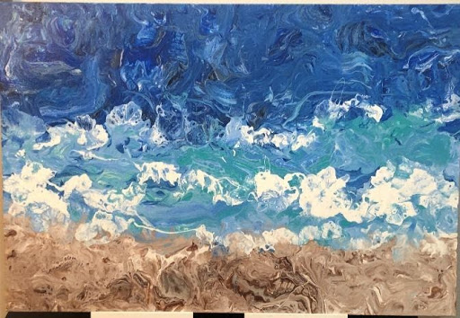
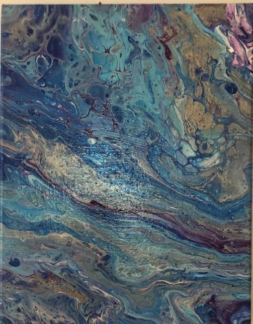
Paint Pour Recipe & Basic Techniques
with Ellen Kanner
Before starting a paint pour, one must have the correct supplies and the correct recipe. The recipe I use can be altered based on the results one desires. As you progress, you may decide that you want different results, in order to have contrasts in your painting. From my experience, I like to use the following described recipe.
Supplies:
- Acrylic Flow Paint, white and 3-4 other colors
- Flood Floretrol Latex Based
- Isopropyl Alcohol 91%
- Silicone Treadmill Oil
- Plastic cups & stirrers
- Gallery traditional canvas
- Propane torch
- Krylon
I start by using Acrylic Flow Paint. I decide which colors I want to use on my canvas. I always use white paint and usually 3-4 colors. If I’m using three colors plus white, I place (4) 12 oz. plastic cups on my tarp covered table. I place stir spoons in each cup.
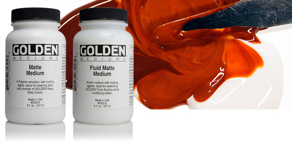
I start by mixing Acrylic paint to Floretrol in a 1:3 ratio. I use the brand, Flood Floretrol Latex Based. My first step is putting 1/3 cup of each color, including the white into individual cups. I then add 2/3 cup of Floretrol into each cup. I stir the mixture around 50x making sure that all paint is mixed well. We now have 4 cups of mixed paint of individual colors. I use the stirrer to check the consistency which should flow like melted ice cream off of the stick. If too thin, I add more paint. If too thick, I add more Floretrol. This step can actually take around ½ hour and it’s very important for the painting.
The next step is adding Isopropyl Alcohol 91% to each color, except for the white. I add ½ tsp to each color and stir 10x slowly. The alcohol assists in creating the cells so this is why I don’t stir it quickly or it might dissolve.
I place my Gallery Traditional Canvas onto four or six cups depending on the size of the canvas, so that it’s balanced throughout. I generally place the cups on each corner under the canvas.
I then put 4-6 drops of Silicone Treadmill Oil into each colored paint cup, excluding the white. With the stirrer, I make a simple x into this mixture. I do not stir all. If you stir the silicone, you will lose the cells.
BASIC TECHNIQUE
I take a different large cup and I start to layer the white and the three colors, such as a sand art item. To me, it doesn’t matter which color I layer with, but the first layer is going to go onto the canvas last, so I generally use white as my bottom layer of paint (meaning the first color I pour into the empty cup is white). I pour approximately 2-3 tbsp of paint for the white. I then proceed to pour from each paint cup into the main cup and I keep alternating the colors (including the white). I don’t necessarily pour in the same order or the same amount. I just do this part by sight. I may pour 1 tbsp of blue and then a few drops of green and a bit of white and then on top of that a larger amount of green, etc. There is no science to this part. I keep going until this 12 oz cup is filled to the top. This also depends on the size of the canvas, so as to alleviate waste.
Then, I place the full cup on the table and I pick up the canvas. I flip the canvas over so that the cup is towards the center of the white side of the canvas. The bottom of the canvas is facing up towards me. Holding the paint cup very firmly, I very quickly flip the canvas and the cup (attached) with my hold right side up. At this point, the face of the canvas is facing up towards me and the cup is flipped over onto the canvas. I hold the cup tightly on the board so no paint seeps out. This part is very tricky. If I don’t have a heavy hand on the cup, the cup can slip and the paint will go all over the place. I quickly place the canvas onto the four cups on the table and make sure that the canvas isn’t tilting and the cups are even underneath. I find this part above to be the hardest. It’s a very quick step.
Now, I gently and slowly lift the cup off of the canvas so that paint slowly pours out of the main cup. One can also shift the cup to the right or the left if desired. Once the cup is empty of the paint, I put the cup down. I gently pick up the canvas so that the paint flows around the canvas and over the sides. I don’t ever touch the paint or the top of the canvas. I’m tilting the canvas with my two hands on the underneath part so as not to get fingerprints on the painting itself.
I then begin to see the beautiful cells and colors flowing and merging together in a very organic style. After tilting the canvas in all directions and I’m satisfied with the direction of the paint, I place the canvas back onto the four cups.
I pick up my Propane Torch. This is the same torch used to make crème brulee. (Lots of food references in this article!) I point the fire towards my canvas in all the different areas. I keep the torch about 1 ½ feet from the canvas for obvious reasons! I don’t get the fire too close to the paint, or it will burn the paint. I’d say I use the torch for about 30 seconds. The fire helps the cells and the colors emerge.
Your paint pour is now complete. I leave it to dry on the cups so it is balanced. If you see a tiny air bubble, you can take a very thin brush or even a toothpick to poke the bubble. It takes at least three days for the painting to fully dry. Once dry, I spray it with Krylon as a protection.
This is the basic formula for my paint pours. There are many other ways to do paint pours, using all types of materials. Some people use balloons, plastic wrap, straws and even blow dryers. It’s a lot of fun and always a surprise at the end. Never predictable. So, if you enjoy abstract art, you’ll love this!!!
_______________________
About Ellen Kanner:
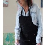 Ellen Kanner is a fluid acrylic artist, creating specialized acrylic paint pours. Currently, I show my work in galleries in New York City and Long Island. I also teach workshops. My work is commissioned, and I create customized projects for clients. My art is inspired by emotions and nature and are organic and one of a kind.
Prior to using this medium, I spent a decade using ceramics and stone. Since discovering the paint pour technique, it has become my true passion.
Her work can be viewed here:
Instagram: el_paintworks
Website: www.elpaintworks.com
Email: elpaintworks@gmail.com


