Swept Away Paint Pour Instructions with Ellen Kanner

Swept Away Paint Pour Instructions with Ellen Kanner

 
Swept Away Advanced Paint Pour Instructions

with Ellen Kanner

Before beginning, refer to Ellen Kanner’s instructions for mixing your paint here

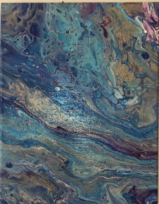
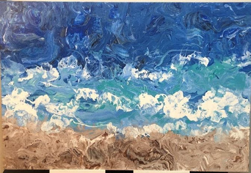
“Swept Away” is a more advanced type of paint pour than what I have described in previous posts.  In this painting I used three sets of paint pours. I created the sand with golds, browns and white.  I created the middle waves with turquoise, darker blue and white.  I created the top section of the ocean with turquoise, dark blue and white.  This was a great deal of preparation, because, as you can see, it was like creating three separate paintings. 

Each section, therefore, had its’ own main layered cup for pouring.  I also left about 1/3 cup of prepared white paint on the side for the waves which I did at the end. 

Instead of flipping each cup for each section, I poured the cup of paint in a horizontal direction.  I did one section at a time. 

Starting with the sand,  I poured the cup of golds, browns and white in a horizontal direction in a few rows where I wanted the sand to be.  I then maneuvered the paint in this area.  

I did the same for each section of the ocean.  It was very challenging, because I had to tilt the canvas in a way that each section of paint wouldn’t cover the other area.  I also wanted the sections to be cohesive and merge with each other.  

Once I was content with the paint, I used the extra white to pour between each section.  I then used a straw and blew in all different directions which allowed me to get the result of the blues going onto the sand and the waves, going up in the air, etc.  I had to view the painting from a distance to see where the waves still needed to go, or where the sand needed to be. This was quite an experience because I didn’t know how it would turn out!!  I was extremely happy with the result. 

_______________________

About Ellen Kanner:

   Ellen Kanner is a fluid acrylic artist, creating specialized acrylic paint pours.  Currently, I show my work in galleries in New York City and Long Island.  I also teach workshops.   My work is commissioned, and I create customized projects for clients.  My art is inspired by emotions and nature and are organic and one of a kind. 

Prior to using this medium, I spent a decade using ceramics and stone.  Since discovering the paint pour technique, it has become my true passion.

Her work can be viewed here:

Instagram:   el_paintworks

Website:     www.elpaintworks.com

Email:         elpaintworks@gmail.com

TAG at Home

[catlist name=tag-at-home]

Paint Pour Recipe with Ellen Kanner

Paint Pour Recipe with Ellen Kanner

 
Paint Pour Recipe & Basic Techniques

with Ellen Kanner

Before starting a paint pour, one must have the correct supplies and the correct recipe.  The recipe I use can be altered based on the results one desires.  As you progress, you may decide that you want different results, in order to have contrasts in your painting.  From my experience, I like to use the following described recipe.  

Supplies:

  • Acrylic Flow Paint, white and 3-4 other colors
  • Flood Floretrol Latex Based
  • Isopropyl Alcohol 91%
  • Silicone Treadmill Oil 
  • Plastic cups & stirrers
  • Gallery traditional canvas
  • Propane torch
  • Krylon

I start by using Acrylic Flow Paint.  I decide which colors I want to use on my canvas.  I always use white paint and usually 3-4 colors.  If I’m using three colors plus white, I place (4) 12 oz. plastic cups on my tarp covered table.  I place stir spoons in each cup.  

I start by mixing Acrylic paint to Floretrol in a 1:3 ratio.  I use the brand, Flood Floretrol Latex Based.   My first step is putting 1/3 cup of each color, including the white into individual cups.  I then add 2/3 cup of Floretrol into each cup. I stir the mixture around 50x making sure that all paint is mixed well.  We now have 4 cups of mixed paint of individual colors.  I use the stirrer to check the consistency which should flow like melted ice cream off of the stick.  If too thin, I add more paint.  If too thick, I add more Floretrol.  This step can actually take around ½ hour and it’s very important for the painting. 

The next step is adding Isopropyl Alcohol 91% to each color, except for the white.  I add ½ tsp to each color and stir 10x slowly.  The alcohol assists in creating the cells so this is why I don’t stir it quickly or it might dissolve.  

I place my Gallery Traditional Canvas onto four or six cups depending on the size of the canvas, so that it’s balanced throughout.   I generally place the cups on each corner under the canvas.  

I then put 4-6 drops of Silicone Treadmill Oil into each colored paint cup, excluding the white.  With the stirrer, I make a simple x into this mixture.  I do not stir all.  If you stir the silicone, you will lose the cells.  

BASIC TECHNIQUE

I take a different large cup and I start to layer the white and the three colors, such as a sand art item.  To me, it doesn’t matter which color I layer with, but the first layer is going to go onto the canvas last, so I generally use white as my bottom layer of paint (meaning the first color I pour into the empty cup is white).  I pour approximately 2-3 tbsp of paint for the white.  I then proceed to pour from each paint cup into the main cup and I keep alternating the colors (including the white).  I don’t necessarily pour in the same order or the same amount.  I just do this part by sight.  I may pour 1 tbsp of blue and then a few drops of green and a bit of white and then on top of that a larger amount of green, etc.  There is no science to this part.  I keep going until this 12 oz cup is filled to the top.  This also depends on the size of the canvas, so as to alleviate waste.                           

Then, I place the full cup on the table and I pick up the canvas.  I flip the canvas over so that the cup is towards the center of the white side of the canvas. The bottom of the canvas is facing up towards me. Holding the paint cup very firmly, I very quickly flip the canvas and the cup (attached) with my hold right side up.  At this point, the face of the canvas is facing up towards me and the cup is flipped over onto the canvas.  I hold the cup tightly on the board so no paint seeps out.  This part is very tricky.  If I don’t have a heavy hand on the cup, the cup can slip and the paint will go all over the place.  I quickly place the canvas onto the four cups on the table and make sure that the canvas isn’t tilting and the cups are even underneath.  I find this part above to be the hardest.  It’s a very quick step. 

Now, I gently and slowly lift the cup off of the canvas so that paint slowly pours out of the main cup.  One can also shift the cup to the right or the left if desired.  Once the cup is empty of the paint, I put the cup down.  I gently pick up the canvas so that the paint flows around the canvas and over the sides.  I don’t ever touch the paint or the top of the canvas. I’m tilting the canvas with my two hands on the underneath part so as not to get fingerprints on the painting itself.  

I then begin to see the beautiful cells and colors flowing and merging together in a very organic style.  After tilting the canvas in all directions and I’m satisfied with the direction of the paint, I place the canvas back onto the four cups.  

I pick up my Propane Torch.  This is the same torch used to make crème brulee.  (Lots of food references in this article!)  I point the fire towards my canvas in all the different areas.  I keep the torch about 1 ½ feet from the canvas for obvious reasons!  I don’t get the fire too close to the paint, or it will burn the paint.  I’d say I use the torch for about 30 seconds.  The fire helps the cells and the colors emerge. 

Your paint pour is now complete.  I leave it to dry on the cups so it is balanced.  If you see a tiny air bubble, you can take a very thin brush or even a toothpick to poke the bubble.  It takes at least three days for the painting to fully dry. Once dry, I spray it with Krylon as a protection. 

This is the basic formula for my paint pours.  There are many other ways to do paint pours, using all types of materials.  Some people use balloons, plastic wrap, straws and even blow dryers.  It’s a lot of fun and always a surprise at the end.  Never predictable.  So, if you enjoy abstract art, you’ll love this!!! 

_______________________

About Ellen Kanner:
   Ellen Kanner is a fluid acrylic artist, creating specialized acrylic paint pours.  Currently, I show my work in galleries in New York City and Long Island.  I also teach workshops.   My work is commissioned, and I create customized projects for clients.  My art is inspired by emotions and nature and are organic and one of a kind. 

Prior to using this medium, I spent a decade using ceramics and stone.  Since discovering the paint pour technique, it has become my true passion.

Her work can be viewed here:

Instagram:   el_paintworks

Website:     www.elpaintworks.com

Email:         elpaintworks@gmail.com

TAG at Home

[catlist name=tag-at-home]

Paint Pour Recipe with Ellen Kanner

Paint Pouring with Ellen Kanner


Acrylic Paint Pour
with Ellen Kanner

Paint Pour is a fluid organic painting that uses Acrylic flow paint and many other materials to create lovely cells and a flowing motion within the creation.

BEGINNERS LESSON:

Before starting a paint pour, one must have the correct supplies.  

Basic Supply List

  • Acrylic flow paint
  • Fluoretrol
  • Treadmill Oil
  • Alcohol
  • Some people use Elmer’s Glue and other oils that they prefer or have found to work for them, i.e. baby oil or even WD-40.  
  • Distilled Water
  • Propane Lighter (one such as used for crème Brulee)
  • Plastic cups 12 ozs
  • Stir sticks
  • Plastic tarp for the floor and table

TAG at home, paint, paint pour, art lesson 

There are many steps involved with paint pour.  In the above painting, I used five colors; gold, blue, white, silver, and purple. 

These colors are placed into a cup layered into one cup i.e. sand art layers. 

After the cup is flipped, I maneuver the canvas and the paint to cover the entire canvas.  It takes technique and trial and error to create paint pours.  One has to slowly maneuver the canvas depending on the outcome that you’re interested in and the direction that you want the cells or the length and width of the cells or the lacy effects. 

I’d like to share the beach scene that I created as well which is a more advanced paint pour.  Thank you for reading my tag.  Be safe and healthy!  Stay creative.

_______________________

About Ellen Kanner:

   Ellen Kanner is a fluid acrylic artist, creating specialized acrylic paint pours.  Currently, I show my work in galleries in New York City and Long Island.  I also teach workshops.   My work is commissioned, and I create customized projects for clients.  My art is inspired by emotions and nature and are organic and one of a kind. 

Prior to using this medium, I spent a decade using ceramics and stone.  Since discovering the paint pour technique, it has become my true passion.

Her work can be viewed here:

Instagram:   el_paintworks

Website:     www.elpaintworks.com

Email:         elpaintworks@gmail.com

TAG at Home

[catlist name=tag-at-home]

Let’s Talk About the Mouth with Rob Silverman

Let’s Talk About the Mouth with Rob Silverman


Let’s Talk About the Mouth
with Rob Silverman

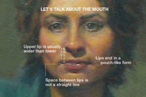
1. BETWEEN THE LIPS

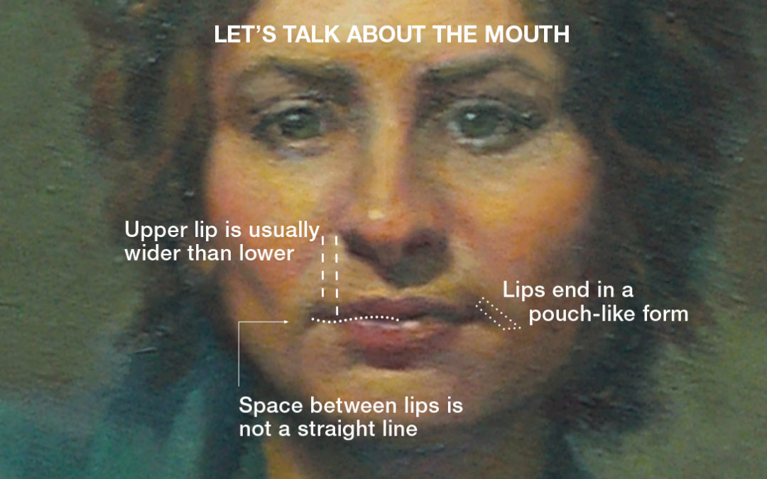
The space between the lips is not a straight line: The middle form of the top lip overlaps the lower lip and the 2 lateral forms of the lower lip overlap the upper lip.

2. LIP SIZE

The upper lip is usually wider than the lower lip.

3. LIP CREASES

The part between the lips does not end at it’s outer edges as a truncated line, but as a pouch-like node at the end, which is tilted toward the nose.

Rob teaches New Strategies & Techniques in Portraiture at The Art Guild and online on Mondays. Register here.

_______________________

About Rob Silverman:

Rob Silverman’s innovative techniques have been featured in American Artist Workshop Magazine and The Art of the Portrait, the official publication of the Portrait Society of America. His work has appeared at Crosby Street Gallery and Spring Studio Gallery in Soho, the Art League of Long Island, Edward Hopper House, The Art Guild of Port Washington, The National Art League, the Lockwood-Mathews Museum, as well as the National Arts Club and Salmagundi Club. View his work at silvermanportraits.com

Rob teaches New Strategies & Techniques in Portraiture at The Art Guild and online on Mondays. Register here.

TAG at Home

[catlist name=tag-at-home]

The Art of the Photo Book with Mark Mancher

The Art of the Photo Book with Mark Mancher


The Art of the Photo / Art book
with Mark Mancher

This note is not intended to be a “how-to” create your own Photo/Art book; numerous websites explain the nuts and bolts far better than I could. Instead, it is a paean to, what I believe is, an art form unto itself and to ask the question – why don’t more of us take advantage of the opportunity to highlight our art or create art using the incredible technology available? Technology which allows us to produce, and even self-publish, our own professional quality Photo/Art books? Particularly at this moment in time, when many of us have a story to tell and the time to tell it. 

Particularly at this moment in time, when many of us have a story to tell and the time to tell it. 

In a time when paper and hardcover books are being supplanted by e-books and audible books, one form of publication cannot easily be replaced by technology – Photo and Art Books. Sometimes referred to with some derision as “coffee table” books, large lush examples published by Rizzoli, Taschen and Phaidon ubiquitously grace the tables and bookshelves in almost every shelter magazine layout. We now all have the ability, with limited “tech expertise,” to create publication-quality, hardcover books, which will look right at home resting alongside the best of those publications. 

Books are easy to create online

There are many sites that offer free downloadable software from Shutterfly, Snapfish and many others. Currently, I use a site called Blurb.com. Most of these sites allow wide customization, innumerable fonts and layouts. You choose the dimensions of the book from several options, the number of pages and the quality of the paper. After you upload your images, you control the arrangement and content of each page and design the cover from a variety of choices.  You can insert text in any way you choose. In short, you have broad artistic control.  After you complete that process, you upload your design and send it off (along with a not insignificant, but not prohibitive, fee) for processing. In short order a very finished looking product arrives at your door. 

Art Books are anthologies.

Most commonly, Art Books are anthologies of the work of the world’s best-known artists and fine art photographers. These unquestionably have value. Without traveling the world, an artist’s work can be admired in a single source and traced through its various stages supported by text and quotes which give the art context. The design, editing and editorial content of the book can express a clear point of view and enhance or even critique the art.

Providing an opportunity to share more.

But, for us, the creation of a Photo/Art book provides an even greater opportunity – the ability to create a personal statement or form of expression which goes beyond what a single image or piece can communicate. To present a body of work and explain in images and words our art and motivation. 

For photographers, the subject matter is limitless, from the simplest details of daily life, like tableaus of daily detritus, to the grand sweep of natural landscapes and everything in between.  In its simplest form, a photo book created on-line answers the question “What do you do with your digital photos?” Many, if not most of us have hundreds of photos lying dormant on our computers (and hundreds of hard copy photos and slides that can be digitized sitting in boxes.) A photobook is a worthy replacement for the old photo album with the advantage that it can be customized, duplicated and doesn’t fall apart. It can be a tool to tell a compelling story of personal or family history, travel and life passage events.

Often uncovering themes

As photographers we often find ourselves drawn to certain subjects which we photograph again and again, street scenes, abstract patterns, nature. Why? Collecting these images and adding to a portfolio is a way to examine these interests. The goal of “working on a book” on the subject is a powerful creative motivator to explore and expand on the theme.  The photographs are no longer an expression of random interest, but a way to more fully examine, for others and ourselves, what draws us to the subject and why it is worthy of appreciation. It captures where we are in the moment and preserves it in tangible form for posterity. 

_____________________________

About Mark Mancher:

  Mark Mancher is an avid, lifelong, amateur photographer. He is a past Art Guild Photograph exhibition winner and an exhibitor at the Martin Vogel Photography Gallery.  He has a particular interest in the photobook as art, both as a collector and a photographer.   

TAG at Home

[catlist name=tag-at-home]

A Few More Tips on the Nose with Rob Silverman

A Few More Tips on the Nose with Rob Silverman

portraiture, rob silverman, portraits, nose, nose tips, painting tips, oil tip  

A Few More Tips on the Nose
with Rob Silverman

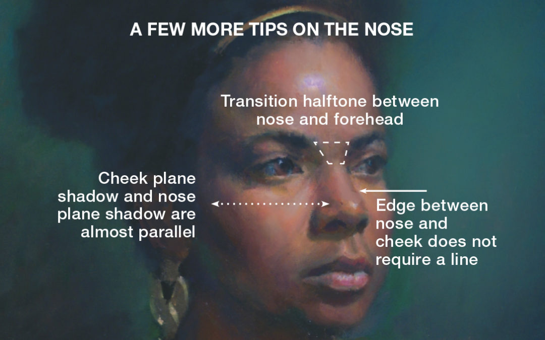
1. NASAL STRUCTURE

Trapezoid shape, the glabella, between nose and forehead is turned down at an angle, creating a slight halftone.

2. PROFILE

Avoid delineating the bridge of the nose (the side that is turned away from the light source) with a hard line. Use a slight tonal change instead.

3. SHADOW

Nose side plane and cheek plane are familial—the planes are generally parallel, although the nose shadow is made a bit lighter from the reflected light bouncing from the cheek.

_______________________

About Rob Silverman:

Rob Silverman’s innovative techniques have been featured in American Artist Workshop Magazine and The Art of the Portrait, the official publication of the Portrait Society of America. His work has appeared at Crosby Street Gallery and Spring Studio Gallery in Soho, the Art League of Long Island, Edward Hopper House, The Art Guild of Port Washington, The National Art League, the Lockwood-Mathews Museum, as well as the National Arts Club and Salmagundi Club. View his work at silvermanportraits.com

Rob teaches New Strategies & Techniques in Portraiture at The Art Guild on Mondays.

TAG at Home

[catlist name=tag-at-home]